Need some unbiased opinions

Your truck sold me on the forged blue. I think I’m gonna m with the red interior accents, and take one from your book with red outlining. It looks great. How did you do the outlining?
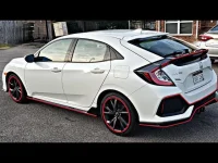
I bought the outline from a vendor on this site.....Rocky Mountain something...I applied it myself. Very easy to do and for the small amount of cash not a bad upgrade.
 
Thanks everyone. The Mrs chimed in and said she loved it with the 4x4 gone and said to leave the rest. Guess what I am gonna do? LOL
 
Added the red trim on the rear ram emblem. Everyone here likes it but I need some blunt opinions from people that have this truck. So should I keep the outlines or delete any?
Don't like the solid red 4x4. Too much red and unbalances it IMO.
 
Added the red trim on the rear ram emblem. Everyone here likes it but I need some blunt opinions from people that have this truck. So should I keep the outlines or delete any?
Honestly just my “Blunt” opinion… it’s a bit cheesy.. I would keep the red on the RHO but get rid of the red on everything else. Usually it’s the small details that show how special a vehicle is. Kinda like Raptor R with just a red R.. all that red reminds me of this… I honestly will probably do something like this on mine. Just a small clean red detail photo #2 RHO/ red rhino combo
 

Attachments

  • IMG_4130.webp
    IMG_4130.webp
    69.8 KB · Views: 18
  • IMG_4131.webp
    IMG_4131.webp
    310 KB · Views: 16
Honestly just my “Blunt” opinion… it’s a bit cheesy.. I would keep the red on the RHO but get rid of the red on everything else. Usually it’s the small details that show how special a vehicle is. Kinda like Raptor R with just a red R.. all that red reminds me of this… I honestly will probably do something like this on mine. Just a small clean red detail photo #2 RHO/ red rhino combo
I think the two logos you are showing would make your truck look cheesey. The rhino should be at either the front or the back on BOTH of them, not one of each. to me that looks cheap. Just my 2 cents ! :)
 
I think the two logos you are showing would make your truck look cheesey. The rhino should be at either the front or the back on BOTH of them, not one of each. to me that looks cheap. Just my 2 cents ! :)
That was just an example of small red accent. I didn’t even realize those are for the sides. Just a photo I had saved. This is what I’m talking about \/
 

Attachments

  • IMG_4132.webp
    IMG_4132.webp
    69.8 KB · Views: 8
  • IMG_4134.webp
    IMG_4134.webp
    22.5 KB · Views: 8
  • IMG_4135.webp
    IMG_4135.webp
    136.2 KB · Views: 8
  • IMG_4137.webp
    IMG_4137.webp
    102.2 KB · Views: 8
Last edited:
Less is always more.

Chris
 

Trending content

Back
Top